Tuesday, November 19, 2013

Performance Art at the Whitney Museum

                Visiting the exhibition called, "Rituals of Rented Island" in the Whitney Museum was definitely a new way that I have experienced artwork before. Each piece of artwork took place in the place, as a temporal art form, performance art can only be recorded through photographs, film, props, and other ephemera from the actual performance. Since the intended object that is presented to the viewer as art not longer exists as the artist fully intended, I felt that the pieces that included a film of the actual performance or a mimicking of the actions in the performance, were the most substantial and impactful to me and relayed the artist's message most faithfully.
                The first piece that had an impact on me was Michael Smith's "Baby Ikki". This piece is a television screen featuring a collection of videos with Smith dressed up as if he was a toddler, quite an interesting contradiction of size and body features. Smith would seemingly transform into a toddler, reenacting many things a typical child would do. Using exaggerated hand and arm motions, hitting, stomping, and grunting or yelling; Smith would take on the role of this toddler and never break character. He performed this on the streets on New York City, in front of skyscrapers, and in a park, any place that was seemingly public and/or well established as a business place where many serious adults would gather or travel through. This is seemingly a commentary on the social structure of the city, and by positioning a large man behaving like a toddler in these public areas where many other adults are, I believe he is creating a satirical work on the definition of being an adult in New York City.
                I next moved on to the Kipper Kids comedic routine called "The Kitchen". This performance piece was much like a play, performed many times with almost identical scripts, so that each showing of this title was very similar to the last. The Kipper Kids were a comedic duo who dressed up with quite interesting costumes. They wore half-face masks with exaggerated noses, a lot of makeup, and drawn on beards. The performance was quite wacky, and had scenes of utter obnoxiousness and vulgar behavior. This is reminiscent of "The Three Stooges" show, with each man playing pranks on the other, but in carefree and comedic way. The ephemera of this performance was substantial, including the actual boxing ring they performed in, with many props and clothing from their shows set on the table beside the large ring. The photographs and one film of such performances actually brought me into that audience, as if I was watching it for the first time.
                The last projects that resonated with me was Vito Acconci's "Proximity Piece" collection of personal space violation performance art. This collection included still photographs of Acconci performing his act, which was his intentional violation of a stranger's personal space in a rather formal and public setting such as the Jewish Museum on the Upper East Side of Manhattan. I felt that there was not enough pictorial evidence of the actual event[s], but the purpose of the project resonated with me. I enjoyed the concept of the intentional invasion of personal space, and was intrigued to find out what kind of reaction this performance would garner from its 'victims'. I feel that Acconci was attempting to comment on the almost silly idea of personal space, it is not something purely definable. One person might not pay any mind to someone standing shoulder to shoulder with you, and another will be uncomfortable if you stand even one foot away. The notion of personal space is extremely subjective and I believe Acconci was attempting to emphasize that.
                Each piece said something different to me, and I believe I was indeed more affected by the pieces that included film along with other ephemera that had the most impact on me. It is obvious to me now, that I would have enjoyed to see these pieces live and in person in order to more fully appreciate them. Just like the difference between seeing a photograph of a painting and viewing the actual paint and canvas, the film or ephemera cannot compare to the 'real thing', the actually experience of the artwork as the artist intended it to be seen.


Michael Smith
"Baby Ikki"
Video
1979

Kipper Kids 
(Martin Rochus Sebastian von Haselberg and Brian Routh)
"The Kitchen"
Video
1979

Vito Aconcci
"Proximity Piece" 
Photographs 
1970

Tuesday, November 5, 2013

ART21: Reaction

            I chose to finish the Art 21 series that was started during class, named 'Transformation'. I feel it is fairly clear that there is a definitive connection between each artist and the concept of transformation.
            For example, a well-known photographer, Cindy Sherman does something interesting in her work. She Transforms! Her transformation is created by using mask, makeup, jewelry, and costumes.  All of her portraits seem to be of different people, yet they are all self-portraits. This signifies a transformation of the physical body. Her journey with this art began when she was young, taking inspiration from film and television, which she brought to her early photography. Later on her art transformed from pure depiction in a movie style (mostly of women) to creating a character from her own mind. I would characterize her as a transformative artist because she changes her body to produce the photographs.
            Yikna Shonibare was the next artist to display such a transformation. His work also began with photography, taking his disability and transforming the her appeared through his Dorian Gray series. His later work changed in a socio-political commentary based on his African heritage and history. The work transforms objects such as headless mannequins into a commentary on power and excess. I would characterize his work as satirical not transformative because of his comedic commentary on power and excess.
            The other artist featured is Paul McCarthy. His transformation in style of work is by far the most distinct. He began with a video series in which he used paint, his body as the tool or brush and a vacant building as the canvas. Later in life he has produced many kinetic and static sculptures which differ greatly from his previous work. I would describe his work as transformative because of the drastic change of ideas and media.
            Overall I would label these artists and their works as transformative, however I had another word in mind too. Introspective. Each artist desired to say something about life and their own opinions or feelings and represent it through their own style and artwork.

LES Galleries Reaction

            This trip took me down to the Lower East Side of Manhattan to view the variety of galleries near Canal street. The neighborhood in which the galleries are located immediately evoke a different feeling than the Chelsea area. The buildings were old with dark colored bricks while Chelsea appeared new with modern construction materials or re-purposed old buildings made to appear new. This immediate difference in neighborhood aesthetics made the Lower East Side galleries seem more approachable. The Lower East Side reflected a sense that the galleries were catering to the every-man while Chelsea is directed toward wealthy and affluent people.
Untitled Gallery
            The first gallery I entered, called "Untitled" featured a single piece of work from many different artists in a variety of themes, this is definitely contrary to the artists featured in Chelsea where a commonality of theme could be seen in the space. The artwork also appeared to express more experimental ideas and greatly varied in its media choice. It was difficult to understand if there was any direction or meaning behind the pieces, but they reflected an adventurous, cutting edge artist, opposed to the delineated and well-established artists of Chelsea.
            The large 'white cube' mode of was present in all of the galleries I visited, reflecting the similar appearance of the Chelsea area, except one the "Castle Fitzjohns Gallery". It had wooden walls with spots of white painted cinderblock and temporary wooden walls with a canvas covering. This presentation gave it an approachable feeling, like I was inside an old/hip bar downtown, an old loft style building, or a large brownstone with exposed walls. There was even a full living room set in one of the rooms where the gallery proprietor was sitting, overall a more informal feeling than the business-like Chelsea galleries.
BOSI Contemporary
            On of the last galleries I visited was "BOSI Contemporary". This space elicited a different feeling from the other two mentioned, with a direction of meaning and theme reflecting some of the Chelsea galleries. It also showcased a single artist Dean Dempsey, and one of the few galleries with an exclusive show. The street it was placed on however, felt old and quaint with many Chinese shops surrounding it. This gave a stark contrast to its white minimalist interior. The artwork was mostly photographs and some photography related sculpture in the basement, all reflecting a theme of dual opposites.

            Overall there are significant differences between these two neighborhoods in terms of their aesthetic qualities and also in the content of the galleries. Speaking with some of the gallery proprietors, they mention that their client base is mostly young people with a desire to make a small investment into a piece of art. They spoke about a desire to make an investment in the hopes that in their future it would be worth a lot. By purchasing from a relatively unknown artist who works on the cutting edge of art, they hope to be on the emerging trend of what is considered valuable artwork.

Galleries:

BOSI Contemporary
48 Orchard Street New York, NY 10002
www.bosicontemporary.com

Untitled
30 Orchard Street New York, NY 10002
www.nyuntitled.com

Castle Fitzjohns Gallery
98 Orchard Street New York, NY 10002
www.castlefitzjohns.com

Tuesday, October 22, 2013

Magritte: The Mystery of the Ordinary

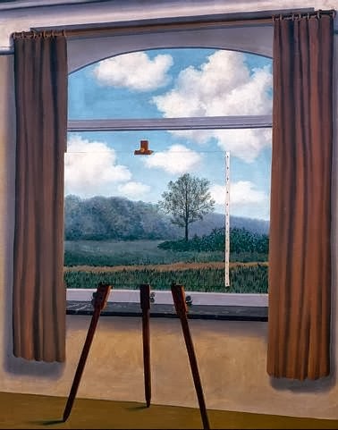
"La condition humaine" (The Human Condition), an oil on canvas painted by RenĂ© Magritte in 1933. This work is a clear juxtaposition of two obviously distinct and individual objects, a painting and a window. What is clear is that the painting perfectly mimics the landscape as seen through the window. Magritte uses the understanding or inference, that what is behind the painting is exactly what is show on the canvas within the canvas. This coherent continuance of the landscape in the background gives the viewer an illusion that what is seen in the painting within the painting actually exists behind that very painting. Magritte then uses the possibility that there is something else other than a tree or hill behind that inscribed painting against the viewer. He denies the viewer a glimpse of the 'reality' behind the painting, yet what is seen in that painting must be true because our perception demands that the directional forces of the road and hill continue and the possibility of a tree existing is in fact, true. This altered perception of a simple window and landscape does comment on the limitations of human perception, the fact that we cannot see what is truly behind this painting, yet we believe it to be real. This fallacy can be applied to any perception, what if what we are led to see and believe is not actually the truth? Can we trust the painting withing the painting? Or has Magritte fooled every viewer who crosses paths with this work? Even his title betrays our own situation; our own 'Human Condition' of perception.


Source

René Magritte
"La condition humaine"
1933
Oil on canvas
39 x 32 in

Sunday, October 20, 2013

Design In Our Lives

                On this particular field trip I visited the Design Galleries and viewed many utilitarian and purely aesthetic designs from a variety of media. The essence of design is to create something that merges function with certain aesthetic qualities. In my opinion, designs that uniquely incorporates ergonomics are of the best quality, since their function has been well adapted for use by human beings. Ergonomics is the study of design and adaptation towards how human beings think and the limits of our physical bodies in association with designed objects. This practical or functional aspect is in my view, is not necessarily an essential part of a good design. Art and design are two separate ideas; with Art having to do with aesthetic emotion, message, and intent, while design is more related to function and purpose. Although they both embody two different sets of ideas there are many points where they overlap. An excellent design incorporates the values of art into its structure, displaying aesthetics and a sense that in essence the design could stand on its own as a work of art, before even mentioning its functional aspects. An outstanding work of art can then too, incorporate well designed function or purpose into its method or final product, giving it meaning as a well designed object before even considering its aesthetic qualities.
                The two pieces I chose to illustrate "high functionality" were SMIT's "GROW" and, Ido Bruno & Arthur Brutter's "EPT - Earthquake Proof Table". I chose both of these pieces because they masterfully incorporated a unique aesthetic into their design elements, yet had very functional aspects that stood out to me. "GROW" is a hybrid energy generating device that delivers both solar and wind power. The design is extremely ergonomic because these photovoltaic panels appear like naturally occurring vines, so it is not intrusive into everyday life. The design is extremely functional because it provides electricity, an essential need of the modern world. It is at the same time an aesthetically pleasing design, with each vine leaf well crafted to mimic nature. The "Earthquake Proof Table" or "EPT" is a steel and birch wood table which is designed to withstand falling objects weighing over 1 metric ton. Each table is engineered to ensure the safety of children that would hide underneath during an earthquake, with its weight resistance its feature. The table looks very unique and could stand on its own as a work of art because of its v-shaped truss and thin armature supporting the sides. This table is very ergonomic because it provides a solution to a dangerous and potentially fatal situation, solving a basic human factor of life. Both of these designs seek to solve an essentially human problem or need, electricity and survival. They also both incorporate their solutions in an elegant way, provoking an aesthetic emotion.
                The two pieces I chose to illustrate "low functionality" were Keita Takahashi's video game "Katamari Damacy" and Gae Aulenti's "Table with Wheels (Model 2652)". I chose both of these pieces because they illustrate either a lack of aesthetic thought or human functionality. "Katamari Damacy" is a video game which incorporates well designed game elements and mechanics, brightly colored objects, places, people. The game combines it with a creative objective, to roll up all the objects in sight into a ball. These well designed elements fit together to make a highly enjoyable game, however they serve no essential purpose that would benefit mankind nor do they provide a solution to any human problem. The only way I could see this video game becoming more ergonomic, is if the essential idea and mechanics of the game were adapted into teaching or some kind of disability therapy. "Table with Wheels" is a glass table with four metal and rubber swivel wheels that looks like a furniture dolly. In my opinion this 'table' does not demonstrate an aesthetic vision nor does it serve any particular function. Because this object's surface is made out of fragile glass, it will not be practical for transporting furniture and therefore could not serve any other function. If I could make this design more ergonomic I would use a more resilient material and somehow redesign the wheels into a more aesthetically pleasing shape or structure.
                In my opinion the essential aspect of design is that it has an aesthetic quality that separates it from the perhaps countless iterations of that object in the world. A highly functional design is one that intelligently interacts with the 'human condition' in a way that solves problems or provides for a need. The artistic elements of design can be separated from the desired function or solution, yet a truly great design would be able to creatively provide solutions and do so in an artistic way. In my view this fine line between aesthetic and function is where design resides, sometimes incorporating one or the other or both or none at all.

Sources:

Ido Bruno, Arthur Brutter
"EPT - Earthquake Proof Table"
2010 
Steel and birch plywood
28 3/8 x 47 1/4 x 23 5/8" 

Keita Takahashi 
"Katamari Damacy"
2003
Video game software

Gae Aulenti
"Table with Wheels (model 2652)"
1980
Glass, Metal, and Rubber
11 1/4 H x 27 1/2 W x 54 5/8" L

Samuel Cabot Cochran, Benjamin Wheeler Howes & SMIT - Sustainably Minded Interactive Technology, LLC
"GROW" 
2005
Thin film photovoltaics, piezoelectric generators, screen printed conductive ink encapsulated in ETFE fluoropolymer lamination, stainless steel, nylon, neoprene rubber, copper wire, and aluminum
16' x 8'

Tuesday, October 15, 2013

Illustrate A Story

In this story featuring Umberto Joseph DeJesus and Nancy Cardona, they talk about the day that the World Trade Center was attacked on September 11th, 2001. Umberto left his post and traveled down to the area where he met a high ranking police officer who was injured. He refused to go to a hospital and instead wished to go back and search for his men who were trapped underneath the rubble of the World Trade Center. My Acrylic on Canvas painting depicts the fallen police officers who were trapped beneath the rubble their red and blue souls still burning within them. I depicted this part of the story because I felt that it was the most poignant, an injured officer who wants to go back and search beneath a fallen building for his comrades.


http://storycorps.org/listen/umberto-joseph-dejesus-and-nancy-cardona/#


Tuesday, October 8, 2013

Chelsea Galleries Reaction

On our second field trip we explored the menagerie of art galleries in Chelsea. This is the home of the collections of the upcoming and well-known artists. My first encounter with a gallery that day was the Raymond Pettibon collection. I left shocked and somewhat disillusioned towards what kind of artwork I would see the rest of the day. I did not enjoy his apparent carelessness and indifference in presenting the artwork which looked as if it was just taped to the wall.
Eddie Anderson - Phillip-Lorca diCorca
Gerald Hughes (aka. Savage Fantasy) - Phillip-Lorca diCorca

My next stop on the road was in the same David Zwirner gallery as Pettibon, 'Street Hustlers' by Phillip-Lorca diCorca, a renowned photographer whose works sit somewhere between documentary and staged photography. His work really caught my photographic eye. I was especially drawn to two prints, "Gerald Hughes" and "Eddie Anderson". These two men are caught within a place and time and seemed to be a part of the scenery. 
The composition of each subject within their setting seemed to be very asymmetrical, yet at the same time had strong directional forces which kept my eye moving around for a long time. The subjects are scaled in the photograph in such a way that their surroundings seem to be just as important as the people themselves. All of the subjects in this exhibit are street hustlers who accept money to do a variety of entertainment activities for their clients. DiCorca propositioned these men for photographs and agreed to pay them their normal entertainment rate. I feel that this kind of photography is an excellent monetary investment because it includes this type documentary photo-journalism. In addition, diCorca captured the essence of a era, place, and face during a moment in our history which meant to me, a hundred years from now viewers would still have a diverse and colorful window into the past. These original photographic prints sell for $30,000 each and I believe would only increase in price towards the future. This is because each print is very poignant and describe a unique individual, time, and place; which is extremely important towards providing future value. The people of the future would also have to see worth in these images as I do, and I believe they would. These photographs would be hanging on my wall during the years for additional admiration and contemplation of their overall design and composition. Overall this exhibit was wonderful, as a photographer; I greatly admired his work. Each print was compositionally beautiful, with varied and interesting choices of scale, proportion, variety and emphasis.


"This Unfortunate Thing Between Us" - Phil Collins
On the other hand, after a few more stops along the 'gallery road' with my renewed sense of enjoyment towards the work after diCorca, I stumbled upon the Tanya Bonakdar gallery exhibiting work by installation artist Phil Collins. I was immediately impressed with the scale of the installations but was taken by surprise with its content. "This Unfortunate Thing Between Us" was a large installation piece which held two seemingly similar trailer homes. Viewers are asked to walk inside the space and experience what Collins has put forth, a large television screen with a bizarre German television show playing in the background. I was put-off by the plainness of the trailers and the absurdity of the television program. The second piece I came to was on the second floor, titled, "my heart's in my hand, my hand is pierced, and hand's in the bag, and the bag is shut, and my heart is caught". This piece was also very large, consisting of 6 large booths with turntables and records along the walls. I enjoyed the music, but thinking economically I would not buy these two pieces. The first piece is selling for $50,000 while the second on the third floor is selling for $25,000. I would not invest in buying these two pieces because of their sheer size, price, and the apparent subjectivity of the meaning which I believe future prospective buyers would not grasp and therefore have no demand t purchase it. If I had to buy them, they are extremely large installations and there is no apartment I would dare to buy, big enough to house these pieces, they would have to stay in storage. 


"my heart's in my hand, my hand is pierced, and hand's in the bag, and the bag is shut, and my heart is caught" - Phil Collins


Tanya Bonakdar Gallery:
Phil Collins
"This Unfortunate Thing Between Us"
2011
$50,000
Two channel video installation presented in caravans, color, sound on 60 min loop

Phil Collins
"my heart's in my hand, my hand is pierced, and hand's in the bag, and the bag is shut, and my heart is caught"
2013
$25,000
Ten 7 inch vinyl records, listening booths, turntables, amplifiers and speakers

David Zwirner Gallery:
Phillip-Lorca diCorca
"Gerald Hughes (a.k.a. Savage Fantasy)" 
Southern California
1990-92
$30,000
Chromogenic print
30 3/4 x 43 3/8 inches (78.1 x 110.2 cm)

Phillip-Lorca diCorca
"Eddie Anderson" 
Houston, Texas
1990-1992
$30,000
Chromogenic print
23 3/4 x 35 3/8 inches (60.3 x 89.9 cm)