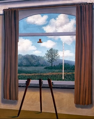
Source
René Magritte
"La condition humaine"
1933
Oil on canvas
39 x 32 in


 On this
particular field trip I visited the Design Galleries and viewed many
utilitarian and purely aesthetic designs from a variety of media. The essence
of design is to create something that merges function with certain aesthetic
qualities. In my opinion, designs that uniquely incorporates ergonomics are of
the best quality, since their function has been well adapted for use by human
beings. Ergonomics is the study of design and adaptation towards how human
beings think and the limits of our physical bodies in association with designed
objects. This practical or functional aspect is in my view, is not necessarily
an essential part of a good design. Art and design are two separate ideas; with
Art having to do with aesthetic emotion, message, and intent, while design is
more related to function and purpose. Although they both embody two different
sets of ideas there are many points where they overlap. An excellent design
incorporates the values of art into its structure, displaying aesthetics and a
sense that in essence the design could stand on its own as a work of art,
before even mentioning its functional aspects. An outstanding work of art can
then too, incorporate well designed function or purpose into its method or
final product, giving it meaning as a well designed object before even
considering its aesthetic qualities.
On this
particular field trip I visited the Design Galleries and viewed many
utilitarian and purely aesthetic designs from a variety of media. The essence
of design is to create something that merges function with certain aesthetic
qualities. In my opinion, designs that uniquely incorporates ergonomics are of
the best quality, since their function has been well adapted for use by human
beings. Ergonomics is the study of design and adaptation towards how human
beings think and the limits of our physical bodies in association with designed
objects. This practical or functional aspect is in my view, is not necessarily
an essential part of a good design. Art and design are two separate ideas; with
Art having to do with aesthetic emotion, message, and intent, while design is
more related to function and purpose. Although they both embody two different
sets of ideas there are many points where they overlap. An excellent design
incorporates the values of art into its structure, displaying aesthetics and a
sense that in essence the design could stand on its own as a work of art,
before even mentioning its functional aspects. An outstanding work of art can
then too, incorporate well designed function or purpose into its method or
final product, giving it meaning as a well designed object before even
considering its aesthetic qualities.

 In this story featuring Umberto Joseph DeJesus and Nancy Cardona, they talk about the day that the World Trade Center was attacked on September 11th, 2001. Umberto left his post and traveled down to the area where he met a high ranking police officer who was injured. He refused to go to a hospital and instead wished to go back and search for his men who were trapped underneath the rubble of the World Trade Center. My Acrylic on Canvas painting depicts the fallen police officers who were trapped beneath the rubble their red and blue souls still burning within them. I depicted this part of the story because I felt that it was the most poignant, an injured officer who wants to go back and search beneath a fallen building for his comrades.
 |
| Eddie Anderson - Phillip-Lorca diCorca |
 |
| Gerald Hughes (aka. Savage Fantasy) - Phillip-Lorca diCorca |
 |
| "This Unfortunate Thing Between Us" - Phil Collins |
 |
| "my heart's in my hand, my hand is pierced, and hand's in the bag, and the bag is shut, and my heart is caught" - Phil Collins |
 Frida Kahlo's "Fulang-Chang and I" (1937) is made with oil paint on
composition board represents, a form of personal identity expressed into
painting. This painting is a self-portrait of Kahlo and her pet monkey. The
monkey was considered to be her surrogate child and reflects her personal
issues of infertility. The closeness of the two figures implies a deep relationship
and alludes to her desire for children. The piece includes depictions of the
imperfections of her own features which describe her desire to convey a great
understanding of her personal appearance; a very personal trait.
Frida Kahlo's "Fulang-Chang and I" (1937) is made with oil paint on
composition board represents, a form of personal identity expressed into
painting. This painting is a self-portrait of Kahlo and her pet monkey. The
monkey was considered to be her surrogate child and reflects her personal
issues of infertility. The closeness of the two figures implies a deep relationship
and alludes to her desire for children. The piece includes depictions of the
imperfections of her own features which describe her desire to convey a great
understanding of her personal appearance; a very personal trait. Ben
Shahn's "Handball" (1939), made with Gouache on Paperboard represents
an aspect of historical identity. Handball was a very popular sport during the
1930-40s, which is reflected in the painting. The clothing that the players
wear is indicative of that time period that has since past. The intensity of
the players lend significance to the game itself, and its historical
importance. The background buildings and advertisements give vague reminders of
its place in history.
Ben
Shahn's "Handball" (1939), made with Gouache on Paperboard represents
an aspect of historical identity. Handball was a very popular sport during the
1930-40s, which is reflected in the painting. The clothing that the players
wear is indicative of that time period that has since past. The intensity of
the players lend significance to the game itself, and its historical
importance. The background buildings and advertisements give vague reminders of
its place in history. Andrew
Wyeth's "Christina's World" (1948) made with Tempera on Panel reflects
a distinctly American cultural identity. Wyeth's cultural background is
displayed by his choice of an arid farmland in Maine as the background. The
choice of depicting a woman in the contemporary clothing facing away from the
viewer towards the dusty farmhouses of the dust bowl era allude to its cultural
significance. - this painting manages to depict a certain American farmland
quality. It showcases a woman in the contemporary clothing facing towards dusty
farmhouses of the dust bowl era. His choice of illustrating a polio stricken
girl crawling through a field attempted to honor her conquest of life. Even
though she has a debilitating illness that has significantly influence American
culture during that period, Wyeth makes a narrative on the power of Christina.
Andrew
Wyeth's "Christina's World" (1948) made with Tempera on Panel reflects
a distinctly American cultural identity. Wyeth's cultural background is
displayed by his choice of an arid farmland in Maine as the background. The
choice of depicting a woman in the contemporary clothing facing away from the
viewer towards the dusty farmhouses of the dust bowl era allude to its cultural
significance. - this painting manages to depict a certain American farmland
quality. It showcases a woman in the contemporary clothing facing towards dusty
farmhouses of the dust bowl era. His choice of illustrating a polio stricken
girl crawling through a field attempted to honor her conquest of life. Even
though she has a debilitating illness that has significantly influence American
culture during that period, Wyeth makes a narrative on the power of Christina.